Brand Identity, Logo Design, Stationery, Brand Guidelines
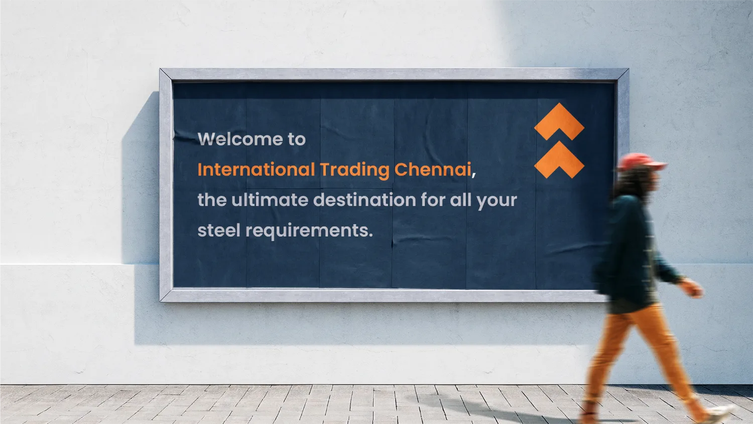
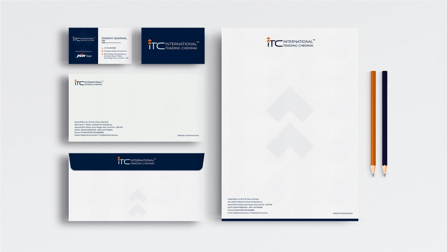
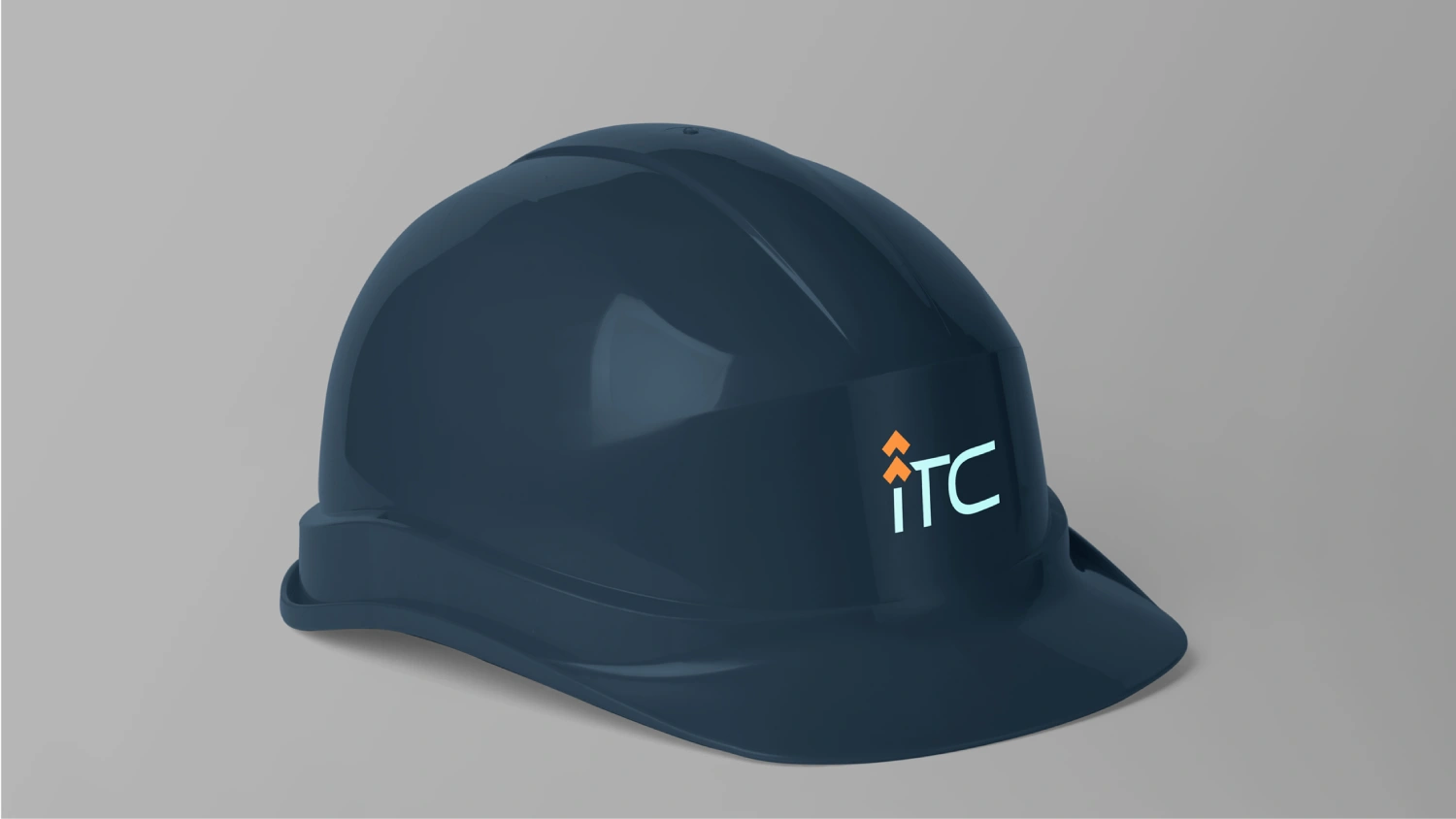
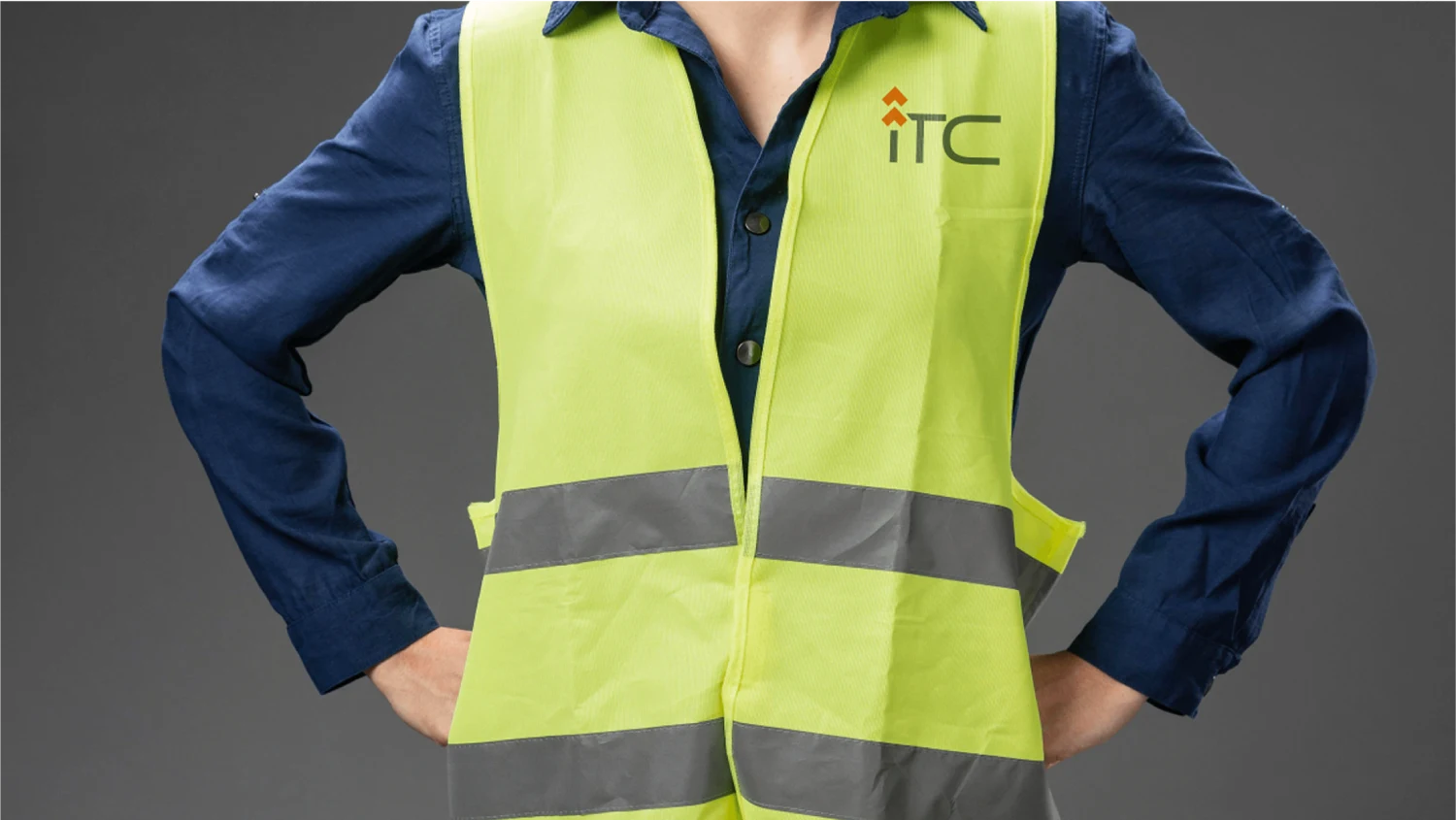
For International Trading Chennai (ITC), we crafted a logo that symbolizes innovation and growth. The upward arrow embedded within the ITC monogram represents the brand’s constant drive for success and momentum. This sleek, forward-looking design captures the essence of ITC’s ambition and vision for the future.
To complement the logo, we chose a bold color palette of steel blues and flame orange, evoking trust, professionalism, and energy. This strategic color combination aligns with ITC’s role in the steel industry as a dynamic, cutting-edge player. With this visual identity, we’ve ensured that ITC stands out in a competitive market, reinforcing their commitment to progress and forward-thinking excellence